Snoops
Zorg Addict
NeRo said:simonbud100 said:What about a Welsh version?
I think somebody has some flashy software .....
") You'll get asked for another one soon
You'll get asked for another one soonNeRo said:simonbud100 said:What about a Welsh version?
You'll get asked for another one soon
EnthuZiaZT said:GazHyde said:Like this Titan? (which is oddly back to my very first design from 3 weeks ago!)

Gary, Perhaps continue the bottom of the Z along to the .org underlining Roadster, it would look more like the gills. You wouldn't be overlapping letters and it might make it easier to line up when sticking on aswell. What do you think. *-Colours are good. but the quote background proves you are right about light coloured cars :-bd

g8jka said:EnthuZiaZT said:GazHyde said:Like this Titan? (which is oddly back to my very first design from 3 weeks ago!)
Gary, Perhaps continue the bottom of the Z along to the .org underlining Roadster, it would look more like the gills. You wouldn't be overlapping letters and it might make it easier to line up when sticking on aswell. What do you think. *-
I quite like this idea, its just plain and simple but classy as well. With picking grey, black or white as well it should go well on any coloured background. If the logo starts to have brighter colours in it may limit what it can be put on, especially on the car itself. Save the colours for mugs, keyrings, shirts etc but I would keep it plain and simple for the car sticks.
I want something subtle, but classy to stick on my zed
 we could make mod swamps 2ft for him in zilver
 SeaSurfer said:chrome ! Silver! ive spent weeks getting rid of all colour on my zed
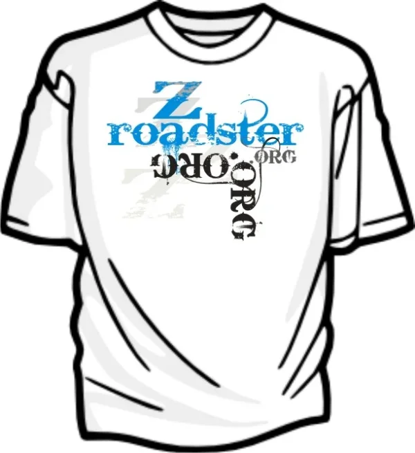
Warrior said:..........(t shirt)