NeRo said:Just playing ...
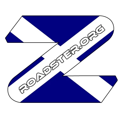
Maybe we should be replacing the OEM Z with a Zorg version

Prefer that to my attempt btw
NeRo said:Just playing ...
") )?
)?No - I usually just adopt itboard said:Are you volunteering for that role?
 3
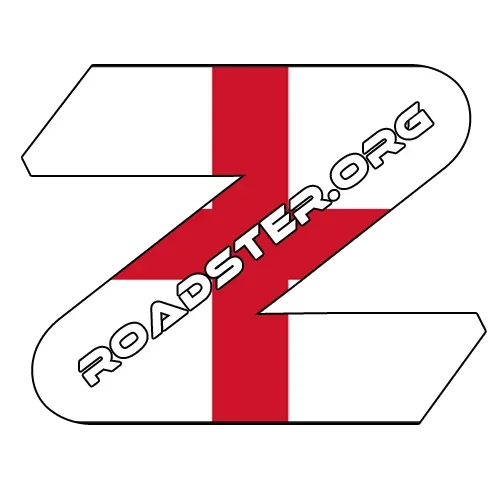
3I'm not keen on the flag versions. they look a bit chavvy to me.GazHyde said:... go more modern with the shadowed font. The modern look would fit in with this site quite nicely, which is modern and fresh looking
NeRo said:Variation on the Z - don't think it look as good
HmmmmSnoops said:Umbrellas
Ice scrapers
board said:I do like the one on the top of the forum at the moment. I guess that can be tweaked slightly increasing the size of the Z so that it fits most merchandise if required. It could be worked for mugs and fits in with clothing items, not sure what it wouldn't work with yet apart from key rings possibly?
Titan said:HmmmmSnoops said:Umbrellas
Ice scrapers
Limited market I feel
I know some of us use our cars year round, but embroidered fleecy blankets may be more popular
I might just buy one of THESE for a laugh
")
GazHyde said:Like this Titan? (which is oddly back to my very first design from 3 weeks ago!)

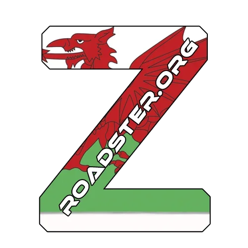
Colours are good. but the quote background proves you are right about light coloured cars :-bdsimonbud100 said:What about a Welsh version?