I would say this has been a long time coming, but as the site has only been live for 5 weeks, perhaps we should say "blimey, already!"
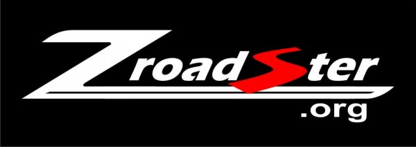
Below is the design. It will come in a couple of different colour variations. Dark colours for contrast against light colours and light colours to contrast against dark (obviously key for car stickers!).
Big thanks to Warrior (Martin) who has designed the logo and putting up with me continually emailing him for the last month! It was his basic design which received such positive feedback that won us over. The design speaks for itself, but obviously encompasses the Z logo which is key. The 'S' of roadster forms a nice S bend road heading off in to the distance...
I can start working on sourcing car stickers now!

Attachments
-
25.9 KB Views: 285
-
29.8 KB Views: 275


